怎么使用CSS實現貨車loader的效果-創新互聯
小編給大家分享一下怎么使用CSS實現貨車loader的效果,相信大部分人都還不怎么了解,因此分享這篇文章給大家參考一下,希望大家閱讀完這篇文章后大有收獲,下面讓我們一起去了解一下吧!

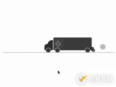
效果預覽
代碼解讀
定義 dom,容器代表卡車,包含的 2 個子元素代表車頭和尾氣;<hr> 代表道路:
<div class="truck">
    <span class="cab"></span>
    <span class="smoke"></span>
</div>
<hr>
居中顯示,同時道路與頁面之間留出空間:
body {
    margin: 10%;
    padding-top: 10%;
}
畫出卡車車廂:
.truck {
    width: 15em;
    height: 5em;
    font-size: 10px;
    background-color: #444;
    border-radius: 0.4em;
}
用偽元素畫出車廂的車輪:
.truck {
    position: relative;
}

.truck::before,
.truck::after {
    content: '';
    position: absolute;
    box-sizing: border-box;
    width: 2em;
    height: 2em;
    background-color: #444;
    border: 0.1em solid white;
    border-radius: 50%;
    bottom: -1em;
}

.truck::before {
    left: 0.6em;
}

.truck::after {
    right: 0.6em;
}
畫出車頭:
.cab {
    position: absolute;
    width: 3.3em;
    height: 2.5em;
    background-color: #333;
    left: -3.5em;
    bottom: 0;
    border-radius: 40% 0 0.4em 0.4em;
}

.cab::before {
    content: '';
    position: absolute;
    width: 2em;
    height: 1.5em;
    background-color: #333;
    top: -1.5em;
    right: 0;
    border-radius: 100% 0 0 0;
}
畫出車頭的車輪:
.cab::after {
    content: '';
    position: absolute;
    box-sizing: border-box;
    width: 2em;
    height: 2em;
    background-color: #444;
    border: 0.1em solid white;
    border-radius: 50%;
    bottom: -1em;
    left: 0.5em;
}
畫出尾氣的初始狀態:
.smoke,
.smoke::before,
.smoke::after {
    content: '';
    position: absolute;
    width: 1em;
    height: 1em;
    background-color: #333;
    right: -0.1em;
    bottom: -0.5em;
    border-radius: 50%;
}
增加排出尾氣的動畫:
.smoke {
    animation: smoke-1 2s infinite;
}

.smoke::before {
    animation: smoke-2 2s infinite;
}

.smoke::after {
    animation: smoke-3 2s infinite;
}

@keyframes smoke-1 {
    to {
        width: 3em;
        height: 3em;
        right: -3em;
        bottom: 0.5em;
    }
}

@keyframes smoke-2 {
    to {
        width: 2.5em;
        height: 2.5em;
        right: -6em;
        bottom: 0.8em;
    }
}

@keyframes smoke-3 {
    to {
        width: 3.5em;
        height: 3.5em;
        right: -4em;
        bottom: 0.2em;
    }
}
增加尾氣的飄散效果:
.smoke {
    animation:
        drift 2s infinite,
        smoke-1 2s infinite;
}

.smoke::before {
    animation:
        drift 3s infinite,
        smoke-2 3s infinite;
}

.smoke::after {
    animation:
        drift 4s infinite,
        smoke-3 4s infinite;
}

@keyframes drift {
    0%, 100% {
        filter: opacity(0);
    }

    15% {
        filter: opacity(0.9);
    }
}
增加卡車行駛的動畫效果:
.truck {
    animation:
        move 5s infinite;
}

@keyframes move {
    0% {
        margin-left: 90%;
    }

    50% {
        margin-left: 45%;
    }

    100% {
        margin-left: 0;
    }

    0%, 100% {
        filter: opacity(0);
    }

    10%, 90% {
        filter: opacity(1);
    }
}
增加卡片行駛中顛簸的動畫效果:
.truck {
    animation:
        put-put 2s infinite,
        move 10s infinite;
}

@keyframes put-put {
    0% {
        margin-top: 0;
        height: 5em;
    }

    5% {
        margin-top: -0.2em;
        height: 5.2em;
    }

    20% {
        margin-top: -0.1em;
        height: 5em;
    }

    35% {
        margin-top: 0.1em;
        height: 4.9em;
    }

    40% {
        margin-top: -0.1em;
        height: 5.1em;
    }

    60% {
        margin-top: 0.1em;
        height: 4.9em;
    }

    75% {
        margin-top: 0;
        height: 5em;
    }

    80% {
        margin-top: -0.4em;
        height: 5.2em;
    }

    100% {
        margin-top: 0.1em;
        height: 4.9em;
    }
}
以上是怎么使用CSS實現貨車loader的效果的所有內容,感謝各位的閱讀!相信大家都有了一定的了解,希望分享的內容對大家有所幫助,如果還想學習更多知識,歡迎關注創新互聯成都網站設計公司行業資訊頻道!
另外有需要云服務器可以了解下創新互聯scvps.cn,海內外云服務器15元起步,三天無理由+7*72小時售后在線,公司持有idc許可證,提供“云服務器、裸金屬服務器、高防服務器、香港服務器、美國服務器、虛擬主機、免備案服務器”等云主機租用服務以及企業上云的綜合解決方案,具有“安全穩定、簡單易用、服務可用性高、性價比高”等特點與優勢,專為企業上云打造定制,能夠滿足用戶豐富、多元化的應用場景需求。
網頁名稱:怎么使用CSS實現貨車loader的效果-創新互聯
URL鏈接:http://www.yijiale78.com/article32/dicppc.html
成都網站建設公司_創新互聯,為您提供定制開發、網站導航、網站制作、網頁設計公司、虛擬主機、全網營銷推廣
聲明:本網站發布的內容(圖片、視頻和文字)以用戶投稿、用戶轉載內容為主,如果涉及侵權請盡快告知,我們將會在第一時間刪除。文章觀點不代表本網站立場,如需處理請聯系客服。電話:028-86922220;郵箱:631063699@qq.com。內容未經允許不得轉載,或轉載時需注明來源: 創新互聯
- 微信定制開發,如何助力提升企業營銷效果 2023-03-22
- APP定制開發流程需求及制作分析 2020-12-05
- 今年做廣州網站定制開發要做什么準備? 2022-12-26
- 成都小程序定制開發要怎么做好,優勢有哪些? 2022-08-24
- 微信小程序定制開發 2022-05-01
- 湖南邵陽企業APP定制開發注意事項及流程 2020-12-06
- 企業網站建設為什么要定制開發? 2021-04-12
- 微信小程序定制開發遇到的十個坑總結分享 2023-02-11
- 上海網站建設定制開發有哪些優勢? 2020-12-22
- 成都西鄉網站定制開發貴在哪里? 2022-12-24
- 網站設計公司最好要走定制開發型路線 2016-11-13
- 天津會展微信小程序定制開發方案 2023-02-15